

Hidden within your data are important insights that can help you drive your business forward. But the challenge is that you don't always make sense if you just look at the raw numbers. When we view data presented in a visual format, patterns, connections, and other insights emerge that might otherwise go unnoticed.
Data visualization brings data to life and allows you to discover and narrate the information hidden in the numbers. Through data dashboards, interactive reports, charts, graphs, and other visual representations, data visualization helps users develop powerful business insights quickly and efficiently. Taken from Microsoft Power BI
I share with you some resources:
Graphics
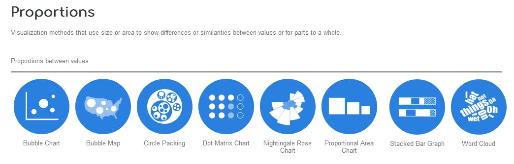
- The Data Visualisation Catalogue : The catalog where you can find graphics differentiated by display categories or by what you want to communicate to the audience.
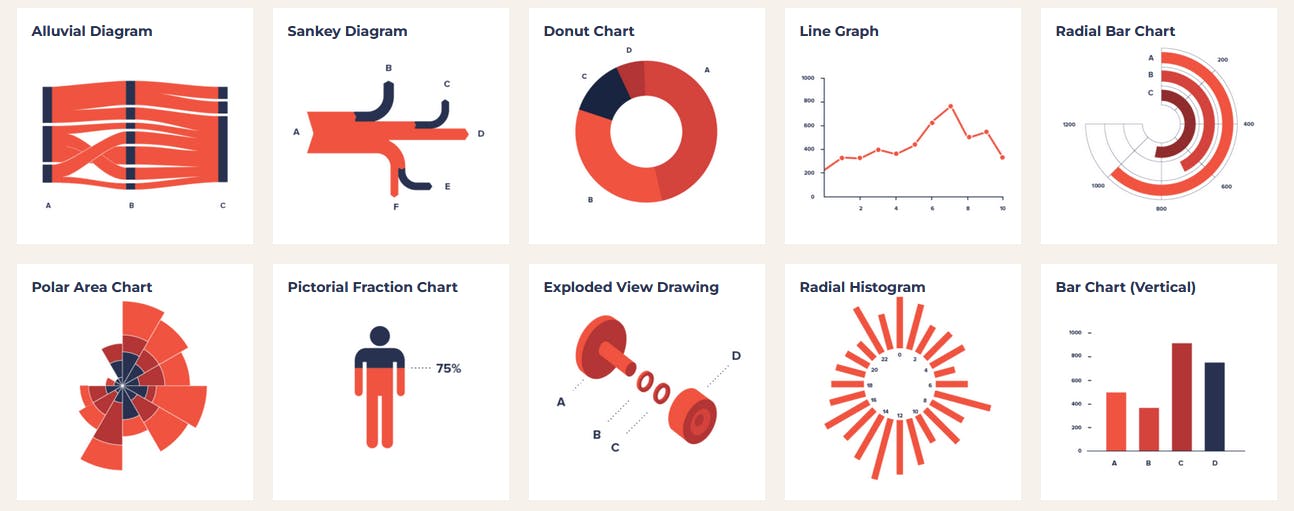
- Data Viz Project: Ferdio is an infographic and data visualization agency and offers these helpful resources
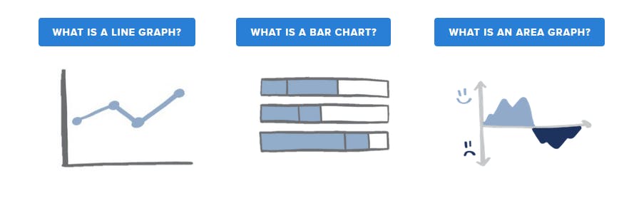
- Storytelling with Data: When telling stories with data, we come across a lot of different charts. This guide shares the good and the bad of commonly used charts and graphs for data communication.
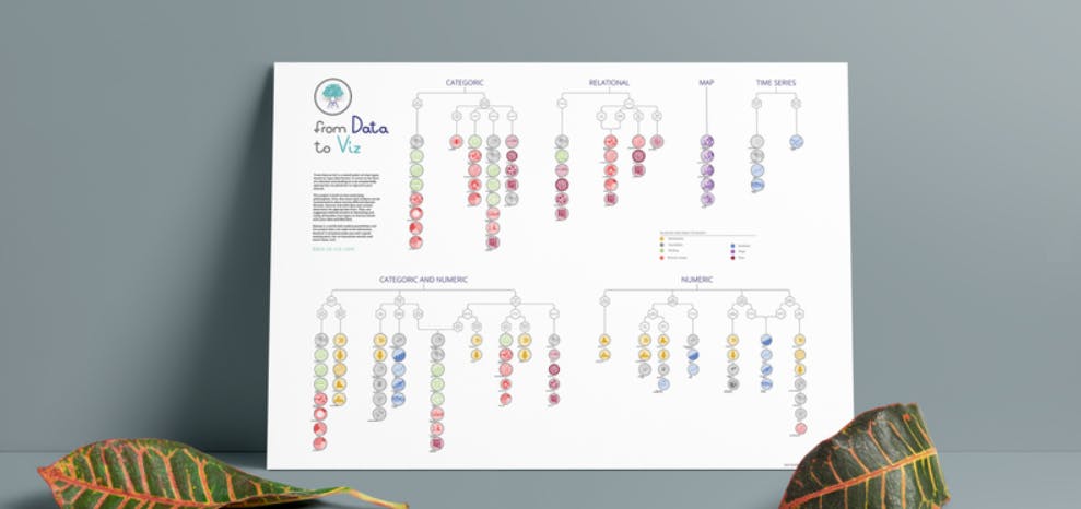
- From Data to Viz: From Data to Viz provides a decision tree based on input data format. This tree leads to twenty formats representing the most common dataset types.
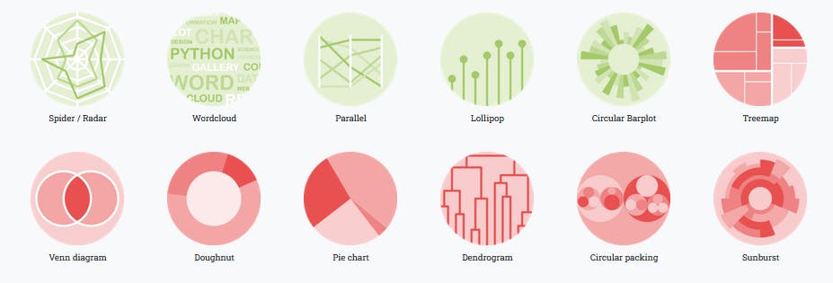
- The Python Graph Gallery: A collection of hundreds of charts made with Python. Charts are organized in about 40 sections and always come with their associated reproducible code. They are mostly made with Matplotlib and Seaborn but other library like Plotly are sometimes used.
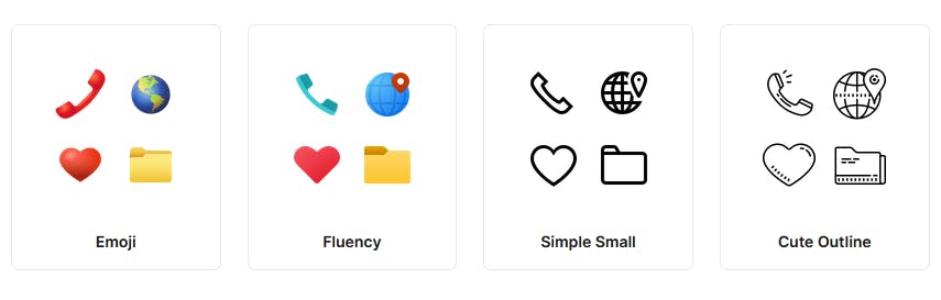
Icons
Images

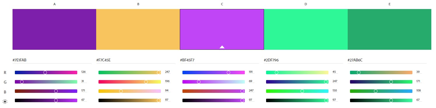
Color palettes
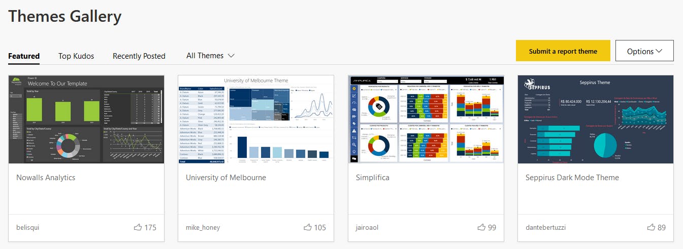
Themes for Power BI